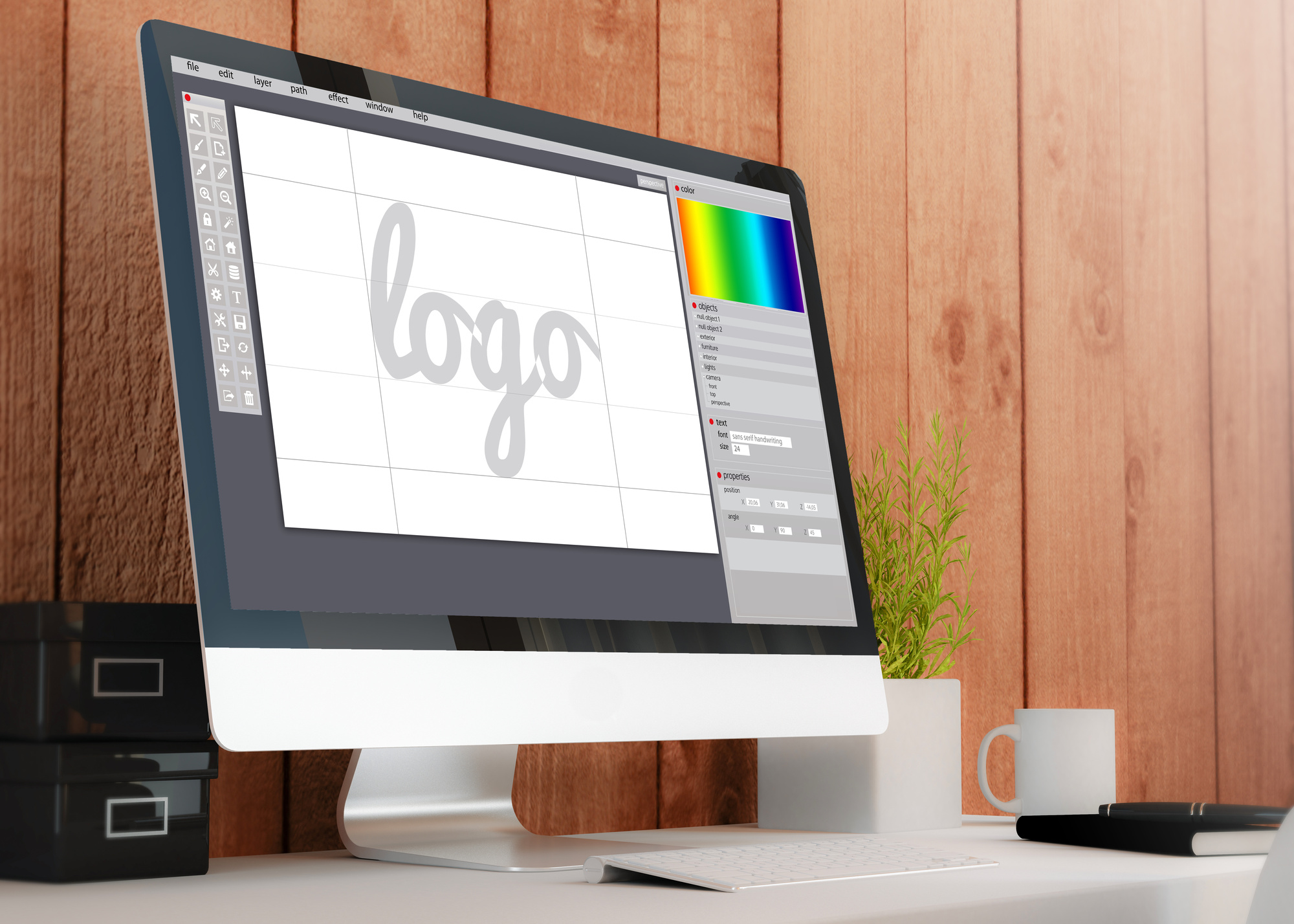
There are numerous factors that go into launching a successful business, such as content writing and internet marketing. However, awesome logos can draw customers in right away.
So what goes into creating a personal logo? Read on to learn 10 tips to help you design awesome logos for your business.
Know What Your Logo Means
A logo cannot just be a striking image. There has to be some type of meaning behind it.
Before going all in on a particular logo, know what it means and how it represents your company. You’re guaranteed to be asked about it.
Make Sure Your Logo Fits Your Brand
Make sure your logo fits your brand. Take the time to understand what type of audience you are going after and cater to them.
Are you trying to appeal to people’s emotions or logic? Classic or contemporary? It depends on your product and services but, more importantly, your audience.
Color is Key
How you want to appear to your audience will also dictate the colors you choose for your logo.
Each color has a particular effect on people. For example, black represents boldness in marketing.
The colors you choose for your logo will illustrate what your business is all about.
Avoid Cliches
Originality isn’t just important to the products or services you’re providing. It’s also essential to the logo you are designing.
Cliche logos are cheap rip-offs that customers won’t remember.
Custom Lettering
Be creative with the font for your logo, too. Don’t just copy a popular brand like Coke or Amazon because they have lots of customers.
Plus, the more original your custom lettering is, the harder it will be for someone to mimic it.
Simplicity is the Smartest Move
You want a logo that catches customers’ eyes, not one that leaves them scratching their heads.
Your logo should be simple and to the point but also not boring. Find small but effective ways of making your logo stand out.
Be Active Instead of Passive
Having your logo be an active symbol instead of a passive one will represent how hard-working and dedicated you are to your brand.
For example, if your logo is some type of bird, have that bird flying instead of just sitting at its perch. It’s a tiny difference but it makes an impact.
Visual Double Entendres
Visual double entendres can say multiple things about your business at once. Plus, they always make you seem clever.
For example, Amazon’s logo just doesn’t tell you the company’s name. The arrow in the logo also indicates that the site provides customers with everything they could need from A to Z.
Symmetry
Not everyone may notice the symmetry of a logo. It’s a subtle but crucial to crafting a great looking design.
Symmetry is all about providing balance to your logo, which also indicates that you have a well-balanced business.
If Your Name is Unique Enough, Use It
An image or symbol isn’t always a perfect fit for your logo. Don’t try to force it.
If your name is catchy or unique enough, you can use it as your logo. A distinct name is always more memorable than a cliche image.
Going Forward With These Tips for Awesome Logos
Keep all of these tips in mind when trying to design a logo for your business.
Awesome logos provide customers with a great first impression whether online or in person.
Do you have any questions about this article or any of our other services? If so, contact us today so we can assist you!


